Page Layout and Composition
Page Layout and Composition Revision Resource
Treatment of images
Designers are able to use specialist treatments such as manipulation to enhance the photograph from the original e.g. sky made bluer. They can also use effects whereby filters are applied to increase or decrease saturation, grain or colour to gain a certain effect e.g. over-exposure suggests nostalgia. Juxtaposition within the images can often create a linking or contrasting relationship between them, whether or not there was one originally. Lastly, the size of an image can indicate its importance, the larger the mage appress to be the more important it must be.
Font
The type of font you chose to use can effect the type of message you're trying to portray. Serif fonts for example are seen as a classic, formal and easier to read, making the message easier to remember understand. This type of font is most commonly used in books.
Sans-serif fonts are seen as less fussy and modern so would be more appealing to children or on posters to stand out. Although, you must be careful that these fonts don't come across too unprofessional and therefore undermining the content.
Hierarchy of type
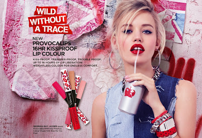
For example, on a magazine the hierarchy of type shows the audience where the most important information is. On a magazine you know the most important part is the masthead because of its large font size and heavy weight, this is also indicated by its positioning normally being located at the very top on the page. By having this hierarchy of type enables the readers eyes to naturally follow the order of what to read and making the average chaotic magazine front cover look very easy to read and understand.
Typography
Typography is the style and size of typefaces (the shape of letters, numbers and symbols that make up a design of type). Typography is used to express hierarchy and brand presence.
White Space
Space is actually just as important as what is on the page. White space separates elements, while drawing your attention to the important ones. This makes the page appear more accessible and clearer for the audience.
Consistency
It is important to be consistent within a brand as it allows products to build band recognition and loyalty with their customers.
Visual Hierarchy
Visual hierarchy is all about working with all the resources in your toolbox e.g. colour, contrast, typography, spacing and other basic principles to help organise and prioritise your content making the products appear more eye catching and clear for customers.
Visual hierarchy is all about working with all the resources in your toolbox e.g. colour, contrast, typography, spacing and other basic principles to help organise and prioritise your content making the products appear more eye catching and clear for customers.


Comments
Post a Comment