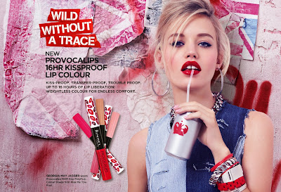
Unseen assessment Analyse the ways in which meaning is constructed in this media product. As Stuart Hall's reception theory explained media products can be decoded by the audience in three different ways; dominant, oppositional and negotiable. On my initial look at the Bill Board, my dominant reception decoded the obvious meaning behind this girly print and recognised its target audience was teenage girls. The mise-en-scene of the print is dominantly pink, stereotypically a girly colour, with an equally as pink British flag in the background making reference to their brand identity, Rimmel London. In addition, the main image of a girl highlights this with the short to medium shot; while making sexual connotation as she softly places the straw on her lip and stares directly at the audience with a seductive look. Moreover, the heading "16hr kiss proof lip" sends the message to girls that they will be ready for any occasion and they won't need to worry about th...
Popular posts from this blog
Weekly blog. Halloween Special.
The Exorcist 3/5 "Will you dare to watch?" The terribly spooky music continuously played in the back ground of most scenes, doesn't hide the irritating fact that the film is definitely not a horror and is nothing but an old fashioned documentary for the light hearted to enjoy. Although, it's the speculation that followed the making of the film that intrigued me most. During the filming of this 1970s "horror" many became convinced that the movie was cursed, and there was strong evidence for this claim too. The death of Linda Blair's grandfather and Max Von Sydow's brother, who died on the first day of filming was the first suspicion. While days later, the son of Jason Miller, who played Father Damien Karras, was nearly killed when a motorcycle hit him, incidents that cannot be explained without referring to the EXORCIST. And the curse of this undoubtably cruel media product does not stop there, as shooting was delayed after the set caug...
Page Layout and Composition
Page Layout and Composition Revision Resource Treatment of images Designers are able to use specialist treatments such as manipulation to enhance the photograph from the original e.g. sky made bluer. They can also use effects whereby filters are applied to increase or decrease saturation, grain or colour to gain a certain effect e.g. over-exposure suggests nostalgia. Juxtaposition within the images can often create a linking or contrasting relationship between them, whether or not there was one originally. Lastly, the size of an image can indicate its importance, the larger the mage appress to be the more important it must be. Font The type of font you chose to use can effect the type of message you're trying to portray. Serif fonts for example are seen as a classic, formal and easier to read, making the message easier to remember understand. This type of font is most commonly used in books. Sans-serif fonts are seen as less fussy and modern so would be ...
Comments
Post a Comment